image

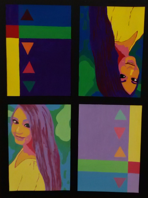
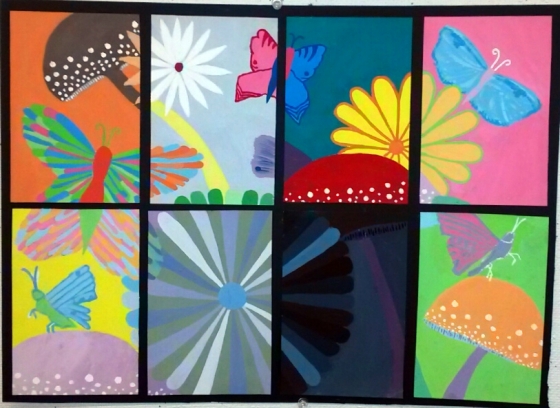
My two words were bright and dull. I should have made the “dull” color palette more desaturated by adding black instead of just white because they still look a bit bright. But overall, I do like how my composition turned out.

image

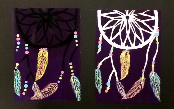
I really enjoyed doing this project. I like how the white one came out. It’s more noticeable than the black one. I also like how the black one makes the colors pop.

image

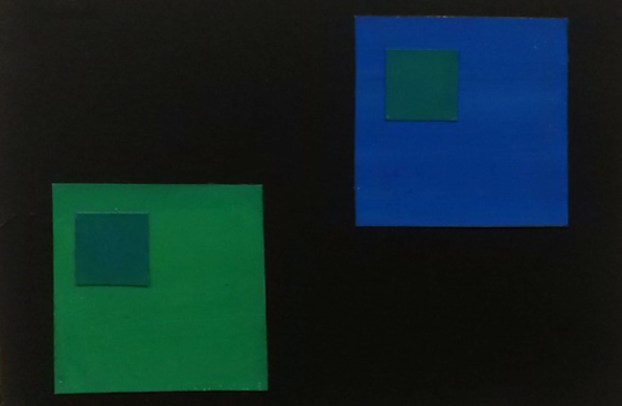
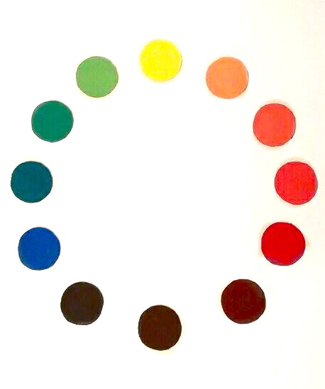
My first try didn’t work at all. But after figuring out the right way to do it (mixing the two different colors to make the smaller square) it actually came out well. I wish I couldn’t see my brush strokes though.

image

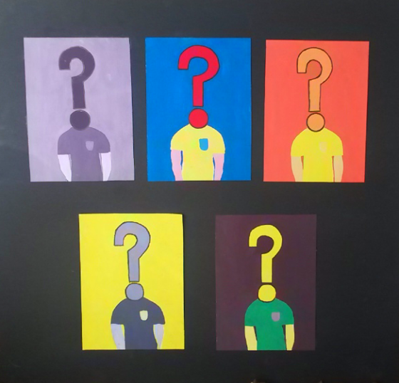
I wish I would have done a more interesting design. The word was “bamboozled” which means confused. Some of the colors were off like the split complementary.

image

I wish my project had more continuity because some of the lines do not match up. I also wish I hadn’t used so much pastel color. I feel like I could have come up with better color solutions that met the criteria.

20130412-113457.jpg

20130412-113504.jpg

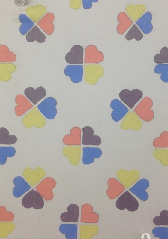
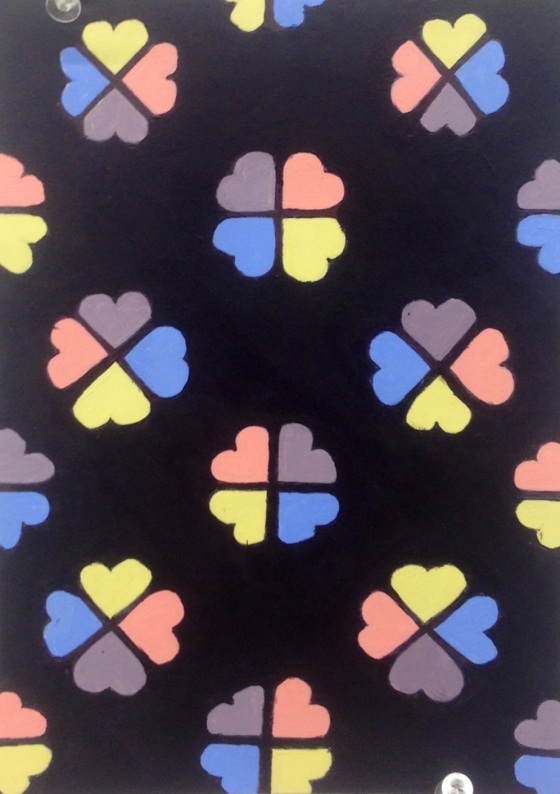
Although this assignment was very time consuming, I enjoyed trying to come up with a cool design and pretty colors. I am happy with my result and I love how the black one turned out. Next time I would like to do a better job of painting (white one).

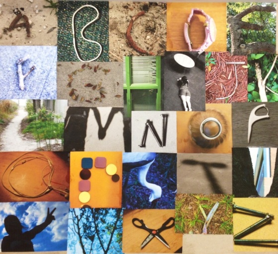
ABCs and 123s

20130412-113140.jpg

I loved this project. Some of my letters were hard to find naturally but other than that it was a lot of fun. I shot with a Canon Rebel xTi. Next time I would like to print out my photos with a better quality printer rather than this one.